
The way you present your content speaks volumes about your brand or business. It’s not just about having high-quality content but also ensuring it’s displayed in a clean, easy-to-understand manner for your audience.
So, how do you decide the best way to showcase your content? This responsibility falls on your CSS.
CSS has always been a crucial part of web development. Since the early days of browsers, we’ve continuously refined how we use it to craft engaging layouts. In the past, building web page layouts was a challenging task, relying heavily on CSS properties like floats, positioning with position, and inline-block techniques.
Today, however, we’re no longer bound by these older methods. Designing modern web layouts has become much simpler, thanks to the evolution of CSS. We now have two powerful layout systems at our disposal: Flexbox and CSS Grid. These tools make it easier than ever to create dynamic, responsive designs.
What is Flexbox?
Introduced in 2009, Flexbox is a modern layout system designed to simplify the process of building responsive web pages and organizing elements efficiently. Since its release, Flexbox has become increasingly popular, and today it’s a go-to solution for creating layouts in modern web development.
Flexbox is a one-dimensional layout system, meaning it operates along a single axis—either a row or a column. This system allows developers to easily create responsive designs without relying on complex hacks or overusing CSS properties like floats and position.
Before diving into when to use Flexbox versus CSS Grid, let’s highlight some key properties that distinguish the two systems.
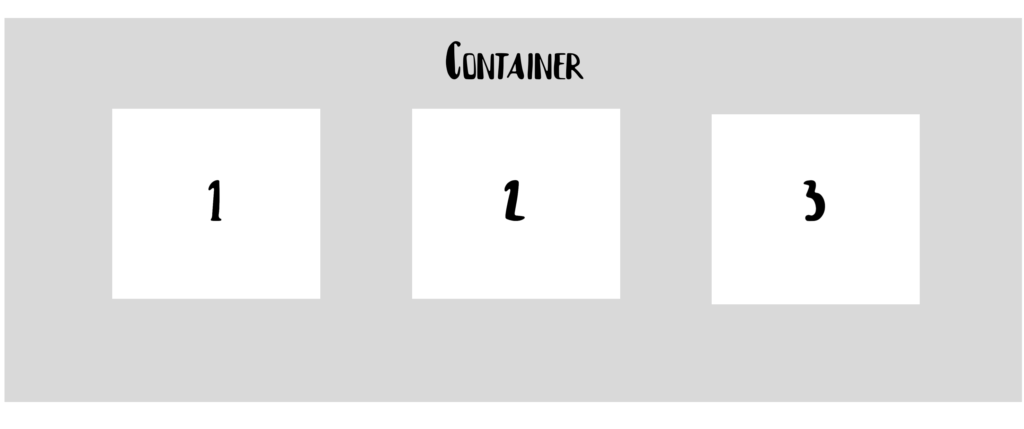
For instance, if you have a <div> element in your HTML that acts as a container for three child elements, all you need to do is apply display: flex to the container. This turns every child element inside the container into a flex item, making it easier to manage and organize them within your layout.
<div class="container">
  <div id="one">1</div>
  <div id="two">2</div>
  <div id="three">3</div>
</div>

.container {
  display: flex;
} 
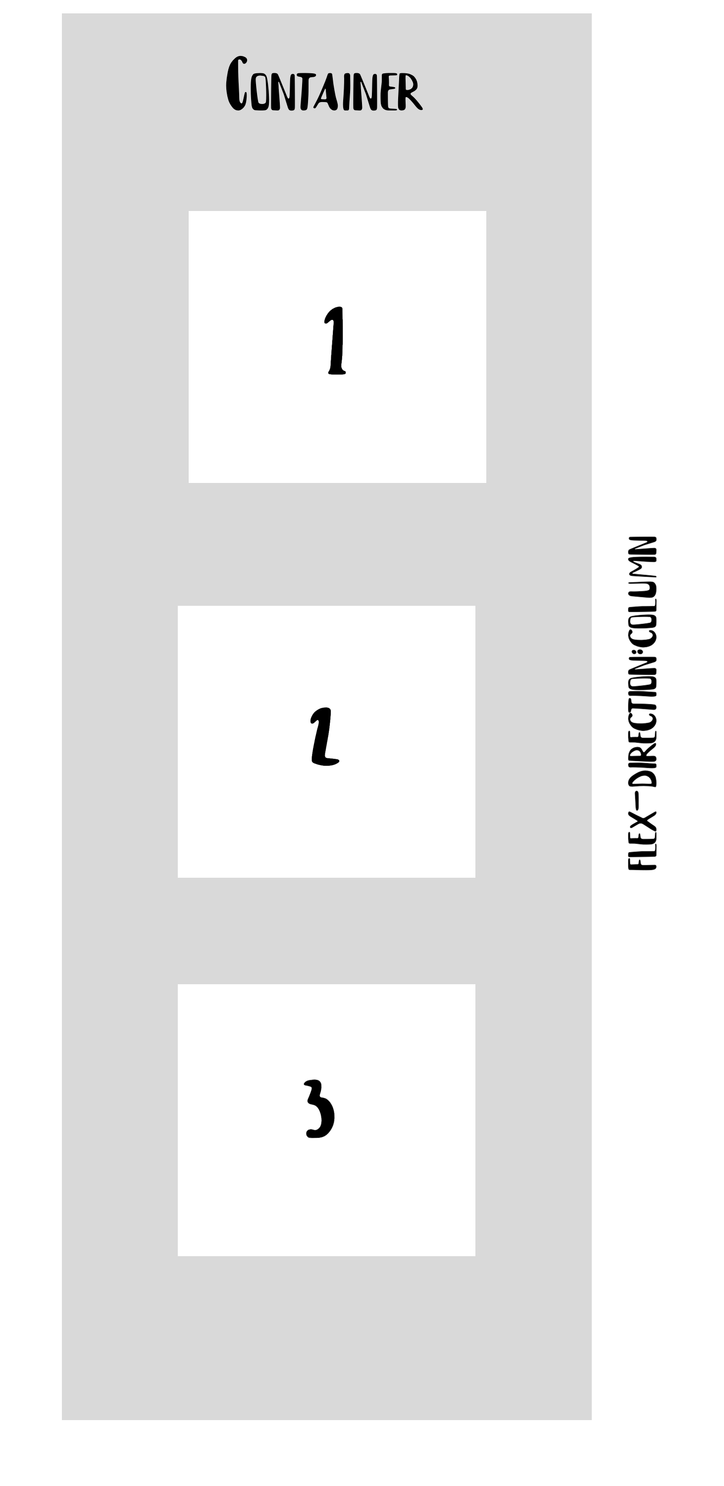
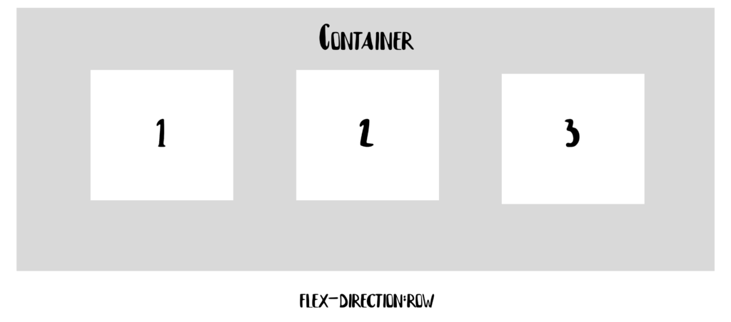
In a Flexbox container, we can choose the direction in which the items are arranged. The two most commonly used flex directions are row and column. Here’s what the corresponding CSS might look like:
.container{
  flex-direction: row | column;
} 
Another interesting property is flex-wrap, which lets items in a flex container move on to the next line when there is no more room:
.container{
  flex-wrap: wrap | nowrap| wrap-reverse;
} 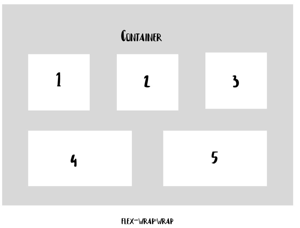
The issue with flex-wrap is that when items wrap onto a new line, they create a separate flex line below the previous one. As a result, the items on the new line may not align perfectly with those above. For example, items like item4 and item5 might spread out to fill the available space, causing uneven alignment with the elements on the line above.
Flexbox offers a wide range of properties that allow us to create amazing layouts. We can control the order of elements, reverse their sequence, and decide whether elements should grow or shrink based on available space. One of the key features that makes Flexbox so powerful is its ability to align items within the container effectively.
To illustrate this, let’s explore some alignment-related properties in Flexbox, like align-self and justify-content.
For example, imagine a container div with four equally sized elements. Using Flexbox alignment properties, we can control how these elements are positioned within the container, creating various layout effects.
<div id="container">
  <div id="one">1</div>
  <div id="two">2</div>
  <div id="three">3</div>
  <div id="four">4</div>
</div>

#one{
  align-self: flex-start | flex-end | center | stretch
}
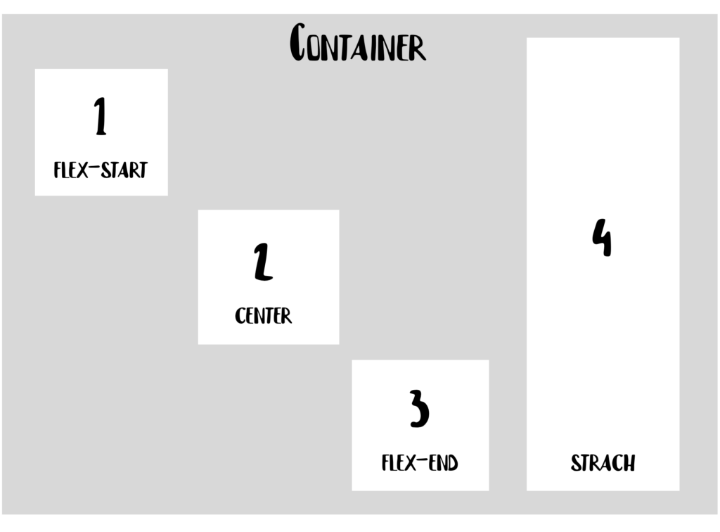
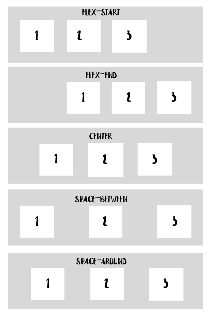
If we want to align all the items together within the container, rather than aligning each item individually, we can use the justify-content property. Now, let’s assume our container holds three items instead of four:
.container{
  justify-content: flex-start | flex-end | center | space-between |    space-around;
} 
What is CSS Grid?
CSS Grid is a two-dimensional layout system that allows us to work with both rows and columns simultaneously. This provides numerous possibilities for creating more complex and organized designs, eliminating the need for the “hacky” methods we used to rely on in the past.
Let’s use the HTML snippet below, and see how we can get a grid layout out of it:
<div class="container">
  <div id="one">1</div>
  <div id="two">2</div>
  <div id="three">3</div>
  <div id="four">4</div>
  <div id="five">5</div>
</div>
To define a grid container, all you need to do is pass a display: grid property to your block element.
To create rows and columns, we use the grid-template-rows and grid-template-columns properties, and pass values that tell how much our grid items will span through the container:
grid-template-columns: 60px 60px;
grid-template-rows: auto;
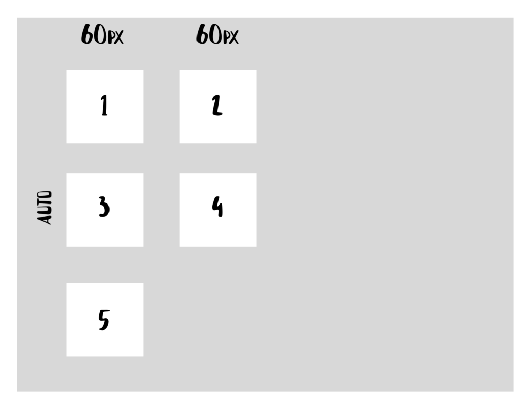
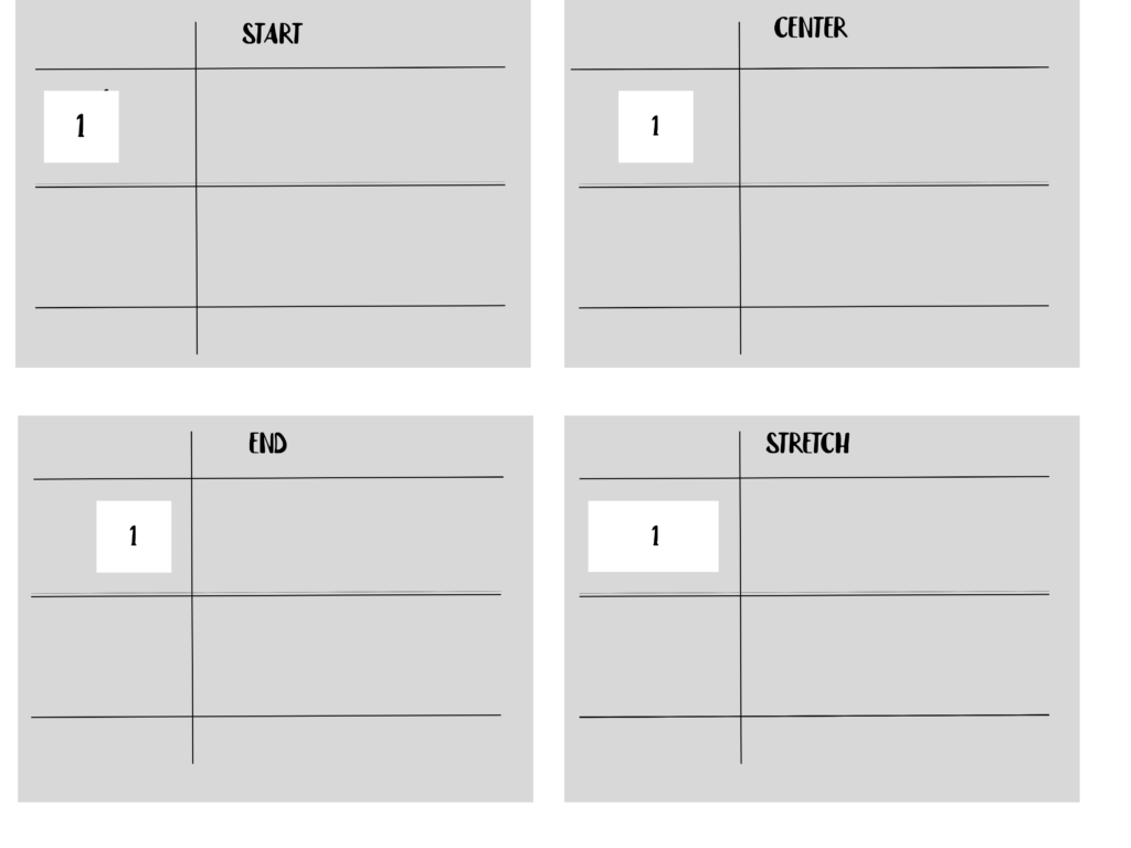
Similarly, CSS Grid offers properties for aligning items within the container. One such property is justify-self, which allows you to align a grid item within its cell along the row axis.
#one{
justify-self: start | end | center | stretch
}
Using the first item in our grid container as an example:
When to use CSS Flexbox
- For layouts with just a few rows or columns.
- For aligning elements: Flexbox is perfect. Simply create a flex container using display: flex, then set the desired flex-direction.
- For a content-first approach: Flexbox works well when you’re unsure how your content will look. It allows everything to fit in naturally.
While you can build an entire application using only Flexbox and achieve similar results to CSS Grid, for a more efficient and maintainable approach, CSS Grid is better. It offers more precision and clarity, making it ideal for complex layouts in the long run.
When to use CSS Grid
- When implementing a complex design: CSS Grid is perfect for handling intricate layouts. Its two-dimensional system allows you to efficiently create complex and maintainable web pages.
- For adding gaps between block elements: CSS Grid offers the gap property, which makes it easy to set space between rows or columns without relying on margins. This avoids potential side effects, especially when working with multiple breakpoints
- For overlapping elements: CSS Grid simplifies overlapping by using the grid-column and grid-row properties, making it effortless. In contrast, Flexbox often requires workarounds like margins, transforms, or absolute positioning.
- For a layout-first approach: If your layout structure is already defined, CSS Grid is more suitable. Its ability to work with both rows and columns simultaneously allows for precise element positioning.

Comments are closed.